I recently had to find a way to generate colours for charts. Specifically, the series in a chart — typically visualized using bars, lines, dots, or areas — are often distinguished using different colours which, for the most part, should be generated and assigned automatically. And while d3.js (on which the chart code was based) offers some pre-defined colour schemes which consequently happen to be used in most d3.js-based projects, they were quite limited for what I needed.
Users sometimes want to specify colours themselves (maybe due to corporate design constraints or other considerations). When they do, any programmatically generated colours should fit these predefined colors while avoiding collisions. For example, it’s very easy to generate the three primary colours red, green, and blue for the following chart with three bar series:
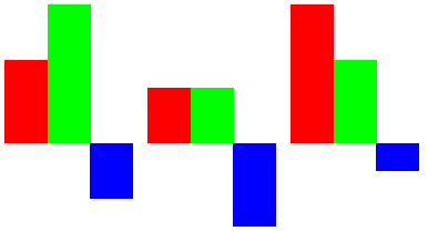
Let’s now say that the user decides to set the color of the third series red, to highlight negative values:
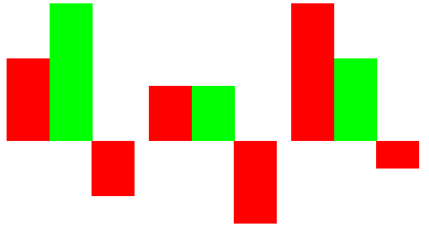
This now clashes with the first series which, by automatic assignment, also happens to be red. We will want our algorithm to assign only colours that are not similar to any user-specified colours. (We need to define “similar” in this context but we’ll get to that later.)
Another example is the use of a colour scheme. Imagine we had to create a chart for IKEA and are required to use the IKEA colours blue and yellow (in the style of the Swedish flag):

Any additional colours should be a variation on these two. Maybe like this:

Or if we allow different hues to be included:

If we even allow neutral colours, i.e. shades of grey, we have a more options:

There are lots of colour generators out there but almost all of them focus on attractive palettes for websites and didn’t provide the features I needed:
- Allow me to specify a number of base colours.
- Generate colours that play well with my base colours.
- Colours need to be distinguishable (high contrast).
- Avoid colours that are too bright (indistinguishable from background) or too dark (indistinguishable from other chart elements like grid lines or text).
After I spent a lot of time reading up on colour spaces and trying out different algorithms, I figured it all came down to being able to calculate how different two colours are. Having a “colour difference function” would allow me to choose colours that are distinct enough while avoiding collisions with colours that are already part of the palette. The easiest way that comes to mind is the Euclidean distance function in RGB space:
d = Math.sqrt((red1 - red2)^2 + (green1 - green2)^2 + (blue1 - blue2)^2)
Unfortunately, this does not work well because what the human eye perceives as different or similar doesn’t map well to the distances calculated with this function:
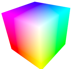
As you can see, yellow and green appear much brighter than blue or red but our difference function would give the same values for different corners (for example when compared to white). This is well-known and therefore, alternative colour spaces and difference functions have been invented. Wikipedia gives a good overview of colour difference functions and I have decided to implement “CIE94” which operates on CIE L*a*b* colours. The “L” stands for lightness which is convenient for us because in the case where we want to create variations on some fixed base colours (e.g. our “IKEA colours”), we only have to change the “L” value.
Here’s what the algorithm does:
- Make a list of the base colours.
- Extend the list by adding more hues (if desired).
- Correct the saturations (if desired; results in better visual consistency).
- For each colour in the list, create a discrete colour range by varying their lightness. We now have a list of colour candidates.
- For the final palette, start with the base colours, then add more colours from the list of candidates. During each step, choose the most distant colour to all previous colours in the palette.
- Optionally, add a light grey and a dark grey.
The algorithm actually makes use of all kinds of colour spaces: Our base colours (step 1) are usually defined using RGB values. To add more hues (step 2), we use the HSL colour space because by keeping “S” (saturation) at 100% and “L” (lightness) at 50% and varying “H” (hue) from 0° to 360°, we get a very wide range of colours that are not too bright and not too dark. To correct saturations, we convert our colours to HCL colour space where we can modify the “C” (chroma) value which is basically the same as the saturation but corresponds more closely to what the human eye perceives as saturation. Finally, in steps 4 and 5, we use L*a*b* colours where we can vary “L” (lightness) and calculate the CIE94 colour difference function.
Fortunately, d3.js provides conversion tools for all of these colour spaces so it makes the palette generation very easy. See this GitHub Gist for the code: