The web browser has become our preferred user interface of choice. But even in 2015, I bump into fellow developers who view the web as nothing more than a bunch of companies’ online presences. Surely, a native Windows client or a Java SWT app must be more powerful than your average web browser. I would have agreed in the days of Internet Explorer 6 (which, by the way, already supported AJAX requests) but luckily, we are long past IE6 and there are now so many web technologies available to us it’s even hard to keep up.
I’ve always done a lot of data visualization work. Even without getting into the topic of Big Data, computers have always been predestined to process and make available a large amount of data. To access that data, a large table might do. But it is often much more useful to display data graphically. I am amazed by how many companies still tell me today: “We have all of this data but we don’t know what’s in there.” Simply because they have no tools to access and visualize that data (other than the grumpy database admin who may run an SQL query for you if you ask nicely).
With SVG, Canvas, or even WebGL supported by all major browsers today, there are endless to possibilities to create stunning interactive visualizations. For a lot of my projects, I settled on the popular d3.js which is extremely flexible. It outputs SVG which, due to the underlying XML/DOM model, makes it very easy to create interactive graphics. Just browse the examples section to see what’s possible.
A bunch of chart libraries exist, some of which are built on top of d3.js: Highcharts, C3.js, n3-charts, or Ember Charts, to name a few. For Stock Performer, however, we needed something more specific and using a standard charts library, we would have quickly hit a limit. d3.js was (and still is) a great choice in creating our charts. Here is an example of a Stock Performer chart:
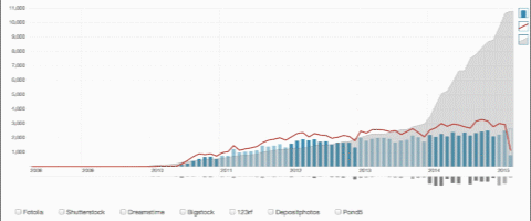
We needed to display monthly revenues (blue bars), downloads (red line), uploads (downward grey bars), and aggregated total downloads (grey area) in one chart. The data for different agencies (selectable at the bottom) needed to be shown individually, in comparison, aggregated as a total, or relative to the total (when selecting the percentage sign in the bottom right corner). What you don’t see in this animation is the ability to drill down, i.e. to click on a bar and move on to a daily view of that month.
A somewhat simpler chart is our vertical breakdown chart:
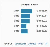
We opted for a vertical bar chart instead of the dreaded pie chart as it is much easier to compare values.
For a major TV broadcast station, I developed charts that visualized at which point before a show was aired, space for commercials were purchased by advertisers:
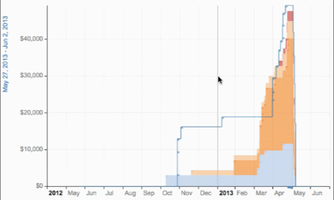
(I have replaced sensitive data with the scribbles you see in the animation.)
The different types of payments are colour-coded and payments are stacked on top of each other so you can determine the total revenue achieved by the day of the broadcast. The mouseover info box needed to be informative but not intrusive. It is slightly transparent and fades out after a second if the mouse leaves the data point in the chart. Here is a more standard chart from the same project:
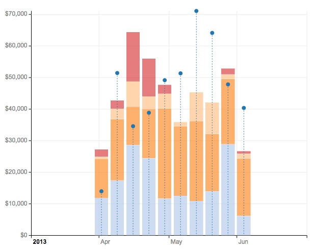
These are the total revenues for a show, displayed per week. The blue dots represent an additional data point to the totals. Individual sales were displayed in a scatter chart:
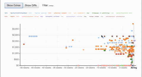
Scatter charts can easily contain too many data points to meaningfully interact with them. I therefore added ways to drill into a specific subset of the data by applying filters.
Lastly, I developed a full-screen interactive Gantt chart in d3.js called Airgantt. At this point, this is a Gantt chart specifically for airline applications such as operations control or crew control. But I may open it up to other applications. It is different from most other Gantt charts in that it has more than just one bar on one line. (Most Gantt charts waste a lot of screen space that way.) In the example below, each line shows events of an aircraft and each bar in that line is a flight (where the plane is in the air) or a maintenance event:
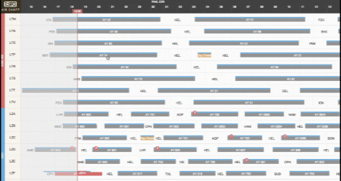
It was important to make this Gantt chart work on mobile devices, too, as users may be moving around the airport with their iPad, needing to access up to date flight schedule information. So it works as you would expect, with swiping, pinching, and tapping. d3.js works very well in a responsive context.
In general, d3.js is a great tool for any type of visualization, especially interactive ones. It is definitely my choice of library for such tasks. I will say, however, that at this point, adding too many elements to a chart will slow down the browser somewhat. Changing one element in the DOM tree even just somewhat will cause the browser to reevaluate the entire layout. For some types of visualizations, therefore, using the Canvas element may be the better choice.