We’re going to create a background like this in pure CSS:
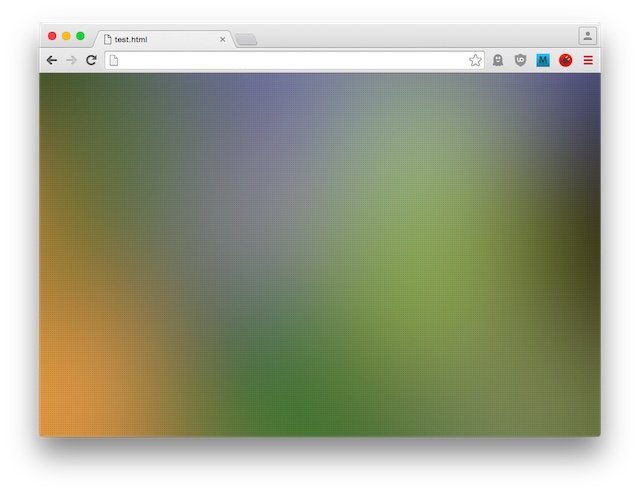
Of course, the simple version would be to simply create a CSS gradient (and there are tools that make creating them easy):

But it just doesn’t look that great, simply because we can only create linear or radial gradients. We want more randomness, something that looks less geometric and predictable.
A common method is to choose a real-life photo and blur it. TinEye offers a free online tool that lets us search for CC Flickr images based on the colours they contain. I added some colours to my search and ended up choosing this picture by Flickr user “whatapar” (under the CC 2.0 license):
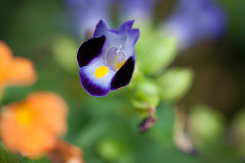
We don’t need most of the information in this photo so let’s scale it down to a mere 8x6 pixels:
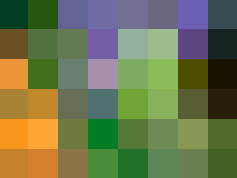
TinyPNG turns this image into 326 bytes and we can use a simple online tool to turn it into a data URI so we can include it directly in our CSS:
body {
    background-image: url("data:image/png;base64,iVBORw0KGgoAAAANSUhEUgAAAAgAAAAGCAMAAADJ2y/JAAAAilBMVEWVsF28hjlmaLKik6tscKNqZKOZr51fZ5Rxc5GjuI9WTYJnaIBsfXBVb26IpWKMlFdlglVndlV1hlRna1Rue1E5SlH/q0uJc0rimEhxdkBXbj/LhDtahzqjgjpcczp9nTnvmzlZWTNYZS85ailmUChLXSYpdSICOSEYIiFMaB4yURAmHApOSgAVDwB+JAIrAAAALnRSTlP+/v7+/v7+/v7+/v7+/v7+/v7+/v7+/v7+/v7+/v7+/v7+/v7+/v7+/v7+/v7+iNdOOwAAAD1JREFUCNcFwYMBADEABLDr27ZZd//1moDJ0ItSp8e31H4QJxyTyNwC2mAnbX7iVriGmR5N+YCs4/ZW3W8BZWUEDXOg7OsAAAAASUVORK5CYII=");
    background-repeat: no-repeat;
    background-size: cover;
}
It would be great if that was all there’s to it. And indeed, in Chrome, it looks quite nice:
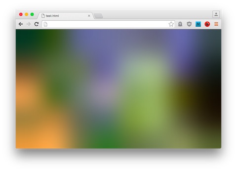
But Firefox does not blur the scaled up image, at least not much:
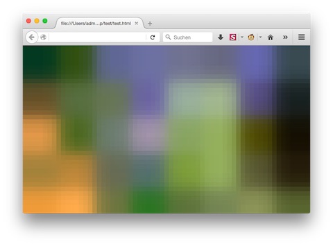
(Update 2021: This appears to have changed as Firefox now applies the same blurring algorithm to scaled-up background images.)
One could add a separate <div> element for the background and apply a filter: blur(10px) to it. But I’m a bit of a purist and adding extra div’s to achieve a purely visual effect is something I try to avoid.
Most modern browsers today support SVG files and the SVG specification includes a Gaussian blur filter (which, in fact, looks even better than the primitive interpolation by Chrome seen above). Let’s create an SVG file with our 8x6 image:
<svg xmlns="http://www.w3.org/2000/svg" xmlns:xlink= "http://www.w3.org/1999/xlink" viewBox="1 1 6 4">
  <image filter="url(#b)" width="8" height="6" xlink:href="data:image/png;base64,iVBORw0KGgoAAAANSUhEUgAAAAgAAAAGCAMAAADJ2y/JAAAAilBMVEWVsF28hjlmaLKik6tscKNqZKOZr51fZ5Rxc5GjuI9WTYJnaIBsfXBVb26IpWKMlFdlglVndlV1hlRna1Rue1E5SlH/q0uJc0rimEhxdkBXbj/LhDtahzqjgjpcczp9nTnvmzlZWTNYZS85ailmUChLXSYpdSICOSEYIiFMaB4yURAmHApOSgAVDwB+JAIrAAAALnRSTlP+/v7+/v7+/v7+/v7+/v7+/v7+/v7+/v7+/v7+/v7+/v7+/v7+/v7+/v7+/v7+iNdOOwAAAD1JREFUCNcFwYMBADEABLDr27ZZd//1moDJ0ItSp8e31H4QJxyTyNwC2mAnbX7iVriGmR5N+YCs4/ZW3W8BZWUEDXOg7OsAAAAASUVORK5CYII="/>
  <filter id="b"><feGaussianBlur stdDeviation=".5" /></filter>
</svg>
This is what it looks like:

You may have noticed the viewBox="1 1 6 4" which crops the SVG’s area by one pixel on each side. This is because the Gaussian filter assumes that everything outside the image is white and therefore introduces a white haze at the borders. Cropping the borders somewhat makes it disappear.
Now we turn this SVG file into a data URI once more and include it in our CSS:
body {
  background-image: url("data:image/svg+xml;base64,PHN2ZyB4bWxucz0iaHR0cDovL3d3dy53My5vcmcvMjAwMC9zdmciIHhtbG5zOnhsaW5rPSAiaHR0cDovL3d3dy53My5vcmcvMTk5OS94bGluayIgdmlld0JveD0iMSAxIDYgNCI+PGltYWdlIGZpbHRlcj0idXJsKCNiKSIgd2lkdGg9IjgiIGhlaWdodD0iNiIgeGxpbms6aHJlZj0iZGF0YTppbWFnZS9wbmc7YmFzZTY0LGlWQk9SdzBLR2dvQUFBQU5TVWhFVWdBQUFBZ0FBQUFHQ0FNQUFBREoyeS9KQUFBQWlsQk1WRVdWc0YyOGhqbG1hTEtpazZ0c2NLTnFaS09acjUxZlo1UnhjNUdqdUk5V1RZSm5hSUJzZlhCVmIyNklwV0tNbEZkbGdsVm5kbFYxaGxSbmExUnVlMUU1U2xIL3EwdUpjMHJpbUVoeGRrQlhiai9MaER0YWh6cWpnanBjY3pwOW5UbnZtemxaV1ROWVpTODVhaWxtVUNoTFhTWXBkU0lDT1NFWUlpRk1hQjR5VVJBbUhBcE9TZ0FWRHdCK0pBSXJBQUFBTG5SU1RsUCsvdjcrL3Y3Ky92NysvdjcrL3Y3Ky92NysvdjcrL3Y3Ky92NysvdjcrL3Y3Ky92NysvdjcrL3Y3Ky92NytpTmRPT3dBQUFEMUpSRUZVQ05jRndZTUJBREVBQkxEcjI3WlpkLy8xbW9ESjBJdFNwOGUzMUg0UUp4eVR5TndDMm1BbmJYN2lWcmlHbVI1TitZQ3M0L1pXM1c4QlpXVUVEWE9nN09zQUFBQUFTVVZPUks1Q1lJST0iLz48ZmlsdGVyIGlkPSJiIj48ZmVHYXVzc2lhbkJsdXIgc3RkRGV2aWF0aW9uPSIuNSIgLz48L2ZpbHRlcj48L3N2Zz4=");
  background-repeat: no-repeat;
  background-size: cover;
}
Looks good, even in Firefox:
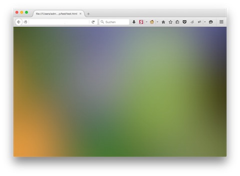
One thing I like to do is give the background a bit of a texture. Again, using SVG here (although a PNG may work well here, too):
<svg width="3" height="3" viewBox="0 0 3 3"
  xmlns:svg="http://www.w3.org/2000/svg" xmlns="http://www.w3.org/2000/svg"
  xmlns:xlink="http://www.w3.org/1999/xlink">
  <rect x="0" y="0" width="1" height="1" style="fill:rgba(0,0,0,.2)"/>
</svg>
It’s a one black, slightly transparent bit pixel at (1,1). Once more, we data-URI it and repeat it over the gradient:
html {
  background-image: url("data:image/svg+xml;base64,PHN2ZyB4bWxucz0iaHR0cDovL3d3dy53My5vcmcvMjAwMC9zdmciIHhtbG5zOnhsaW5rPSAiaHR0cDovL3d3dy53My5vcmcvMTk5OS94bGluayIgdmlld0JveD0iMSAxIDYgNCI+PGltYWdlIGZpbHRlcj0idXJsKCNiKSIgd2lkdGg9IjgiIGhlaWdodD0iNiIgeGxpbms6aHJlZj0iZGF0YTppbWFnZS9wbmc7YmFzZTY0LGlWQk9SdzBLR2dvQUFBQU5TVWhFVWdBQUFBZ0FBQUFHQ0FNQUFBREoyeS9KQUFBQWlsQk1WRVdWc0YyOGhqbG1hTEtpazZ0c2NLTnFaS09acjUxZlo1UnhjNUdqdUk5V1RZSm5hSUJzZlhCVmIyNklwV0tNbEZkbGdsVm5kbFYxaGxSbmExUnVlMUU1U2xIL3EwdUpjMHJpbUVoeGRrQlhiai9MaER0YWh6cWpnanBjY3pwOW5UbnZtemxaV1ROWVpTODVhaWxtVUNoTFhTWXBkU0lDT1NFWUlpRk1hQjR5VVJBbUhBcE9TZ0FWRHdCK0pBSXJBQUFBTG5SU1RsUCsvdjcrL3Y3Ky92NysvdjcrL3Y3Ky92NysvdjcrL3Y3Ky92NysvdjcrL3Y3Ky92NysvdjcrL3Y3Ky92NytpTmRPT3dBQUFEMUpSRUZVQ05jRndZTUJBREVBQkxEcjI3WlpkLy8xbW9ESjBJdFNwOGUzMUg0UUp4eVR5TndDMm1BbmJYN2lWcmlHbVI1TitZQ3M0L1pXM1c4QlpXVUVEWE9nN09zQUFBQUFTVVZPUks1Q1lJST0iLz48ZmlsdGVyIGlkPSJiIj48ZmVHYXVzc2lhbkJsdXIgc3RkRGV2aWF0aW9uPSIuNSIgLz48L2ZpbHRlcj48L3N2Zz4=");
  background-repeat: no-repeat;
  background-size: cover;
}

body {
  background-image: url("data:image/svg+xml;base64,PHN2ZyB3aWR0aD0iMyIgaGVpZ2h0PSIzIiB2aWV3Qm94PSIwIDAgMyAzIg0KICB4bWxuczpzdmc9Imh0dHA6Ly93d3cudzMub3JnLzIwMDAvc3ZnIiB4bWxucz0iaHR0cDovL3d3dy53My5vcmcvMjAwMC9zdmciDQogIHhtbG5zOnhsaW5rPSJodHRwOi8vd3d3LnczLm9yZy8xOTk5L3hsaW5rIj48cmVjdCB4PSIwIiB5PSIwIiB3aWR0aD0iMSIgaGVpZ2h0PSIxIiBzdHlsZT0iZmlsbDpyZ2JhKDAsMCwwLC4yKSIvPjwvc3ZnPg==");
  margin: 0;
}
Here we have the final product, achieved with 1,440 bytes of CSS (uncompressed):

To see the texture better, here’s an original scale screenshot:
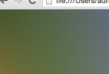
I noticed that some browsers seem to take quite some time rendering the gradient. I assume it’s because scaling the SVG up to page size also increases the size of the Gaussian filter. So at the moment, likely until we have more GPU-based rendering of websites, there is a tradeoff to make: This solution minimizes network traffic but page render times are somewhat slow. To speed up the page render time, it’s probably better to load a gradient image.